Reference Fields
Multi Select
The Multi Select field allows, just like the Combo Box, users to add one or more values of a predefined list, storing them as an array in the database.
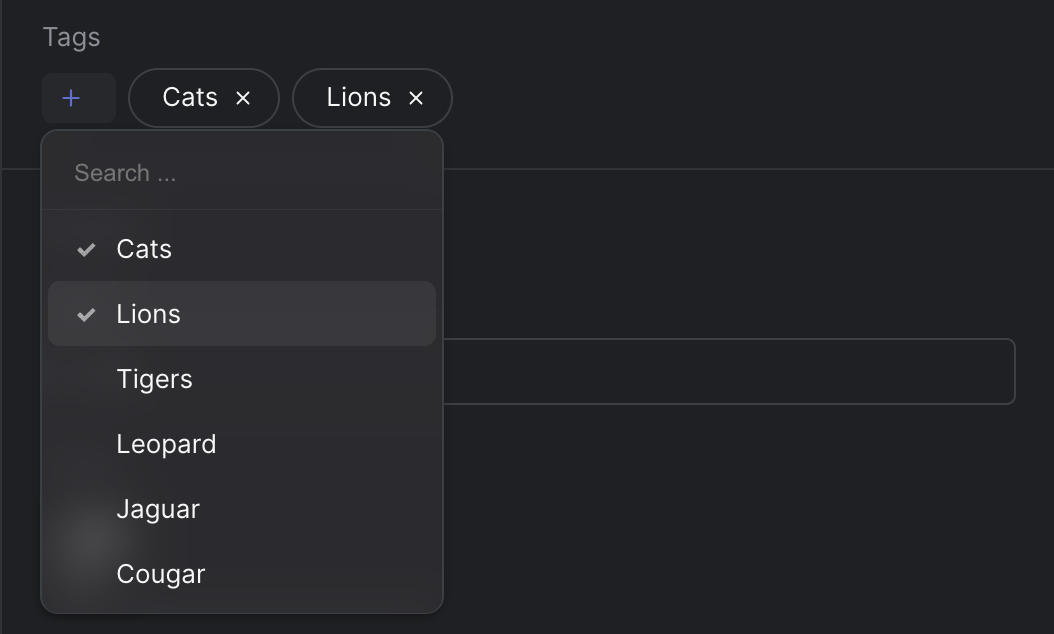
Strife Studio screenshot of an Multi Select field
Settings
In addition to the basic settings, this section provides information about unique settings and configurations specific to this field.
You can find a comprehensive list of all basic settings in the 'Overview' section.
| Option | Description |
|---|---|
Placeholder | Display a placeholder text in the search field after opening the combo box |
Check marks | Enables check marks on the selected values |
Options | Defines the choices presented in the drop-down. Each option is represented as an object containing a name, value, and color hex value (optional) |
Define with JSON
When defining templates using JSON, this field is represented using:
- Component Name:
str-multi-select - Type:
multi-select - Reference ID:
str-multi-select
The settings above map into the editor.attributes object inside the JSON definition.
{
  ...
  "editor": {
    "name": "str-multi-select",
    "type": "multi-select",
    "propertyName": "...",
    "attributes": {
      "placeholder": "...",
      "switches": true,      //Check marks
      "externalDataSource": "..."
    },
    "options": {
      "options": [
        {
          "name": "...",
          "value": "...",
          "color": "...",  //Optional, hex color format
          "icon": "...",   //Optional, name of icon
          "avatar": "..."  //Optional, url to avatar
        },
        ...
      ]
    }
  },
  ...
}
Live preview
This field does not have any default Strife Web Components. Custom live preview implementations are fully supported.
For more information on live preview and Strife Web Components, please refer to the Live preview documentation.