@Model?.Heading
@Html.Raw(Model?.Body ?? "")
| Tutorials | Start here! The tutorials will get you started with Strife in no time. | getting-started | |
| How-to Guides | Step-by-step guides showing how to achieve common tasks in Strife | how-to-overview.md | |
| Reference | The gory details about Strife's SDKs, APIs and configuration | reference-overview.md | |
| Explanation | Discussions and deep dives into key topics of Strife | explanation-overview.md |
{data.description}
``` This requires loading `@strifeapp/strife` eagerly in your root layout (otherwise the iframe handshake completes before subscribers are ready). For full setup, the data-shape reference, and framework-agnostic patterns, see [Custom Live Preview implementation](https://strife.app/docs/reference/live-preview/custom-live-preview-implementation.md). *** #### Snapshots (optional) Editors can hand a reviewer without a Strife account a **preview link** — `https://example.com/snapshot/{token}` — that shows a frozen, unpublished version of a document on your site for 7 days. The integration's snapshot middleware resolves the link; you add the page that renders it. Add `src/pages/snapshot/[token].astro`. A minimal version is below; the complete template, with the rules a snapshot page must follow, is in the [Snapshots](https://strife.app/docs/reference/snapshots.md) reference. ```astro --- export const prerender = false; // rendered on demand — never prebuilt import Layout from '../../layouts/Layout.astro'; const { name, expiresAt, locale, content } = Astro.locals.snapshot!; ---{home.heading}
``` Congratulations! You have now seamlessly integrated real-time data updates into your Next.js application using the Strife JavaScript SDK. 🎉 --- # Create a dynamic employee list using the Chapters field Source: https://strife.app/docs/tutorials/create-a-dynamic-employee-list-using-the-chapters-field This tutorial provides step-by-step instructions for implementing the Chapters field using .NET and enabling the live preview. In this tutorial, you will learn how to implement a dynamic employee list in Strife Studio. The example leverages the Chapters field and .NET (C#). > [!WARNING] > Ensure that the C# SDK is installed on your website. For detailed instructions, refer to [this how-to guide](https://strife.app/docs/how-to-guides/installing-c-sdk.md). > [!NOTE] > Please review the [Chapters field reference](https://strife.app/docs/reference/fields/chapters.md) and check the [Strife Web Components guide](https://strife.app/docs/reference/live-preview/web-components.md). ### Template First, create a content template called 'Employee'. Add a couple of fields for displaying information about the employee; such as 'Name', 'Role', 'Image'.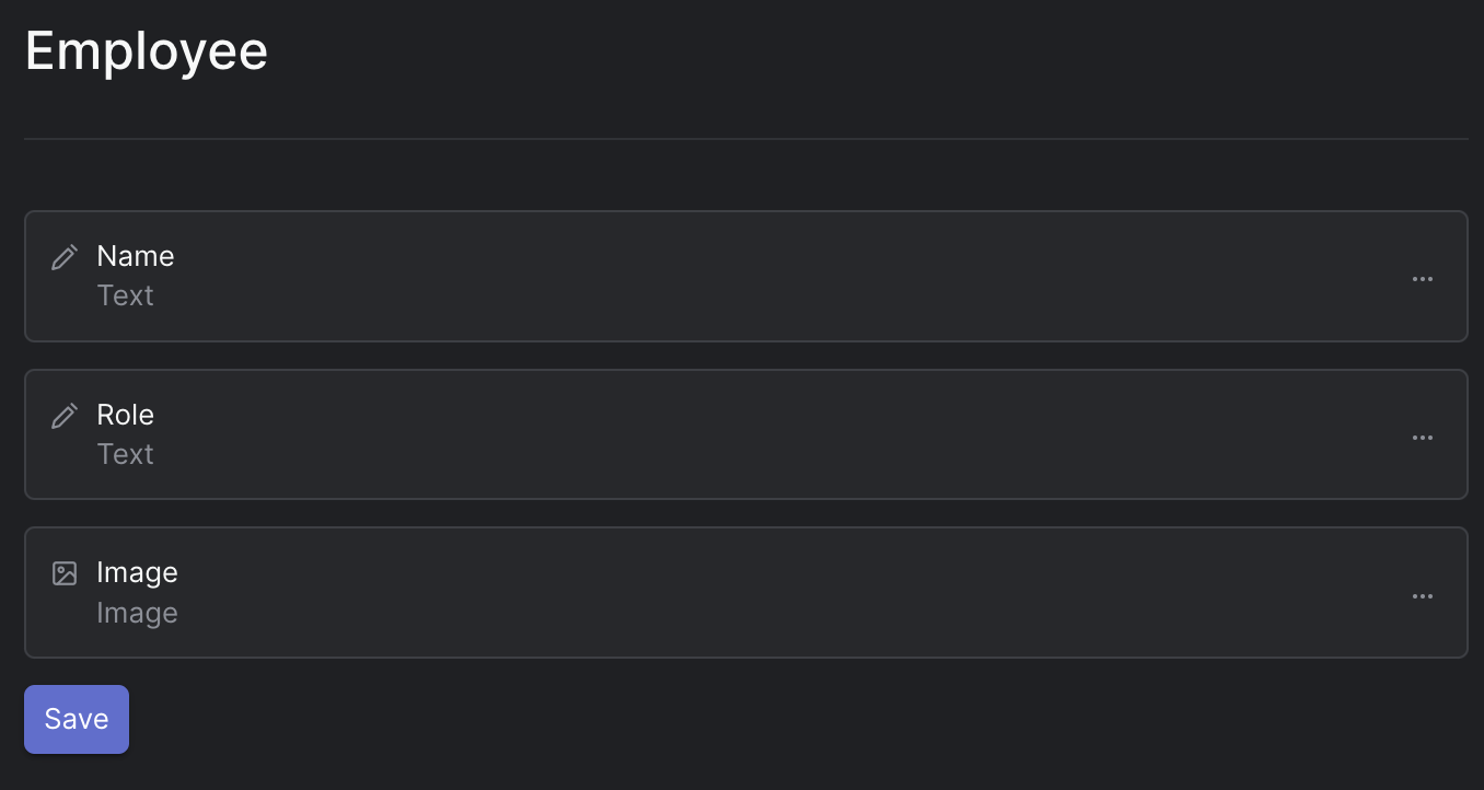
Employee Content Template
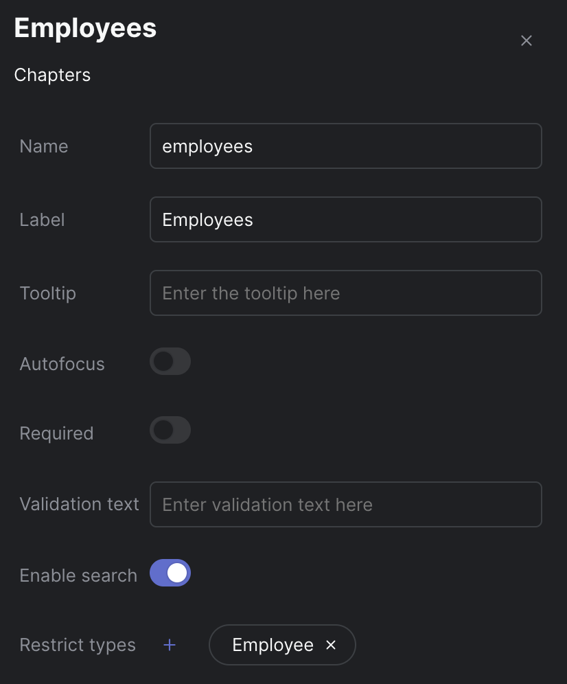
Chapters settings
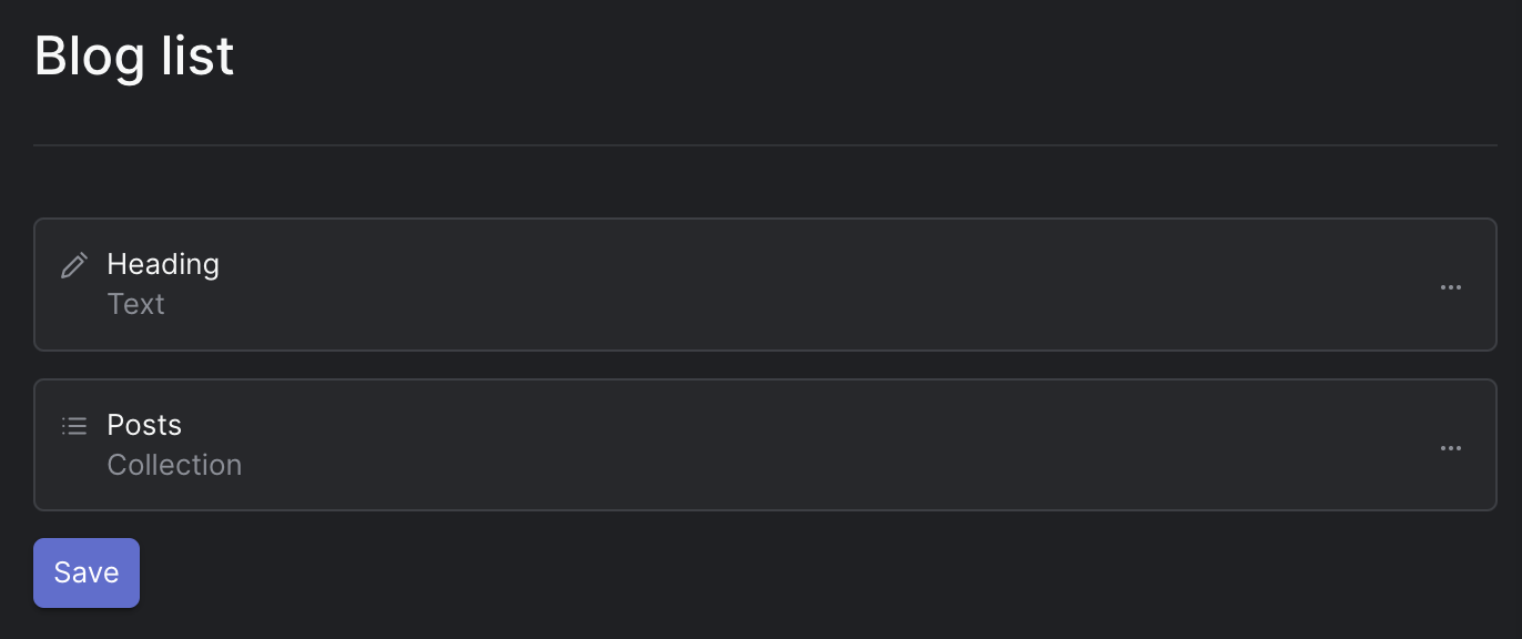
Simple Blog List Template
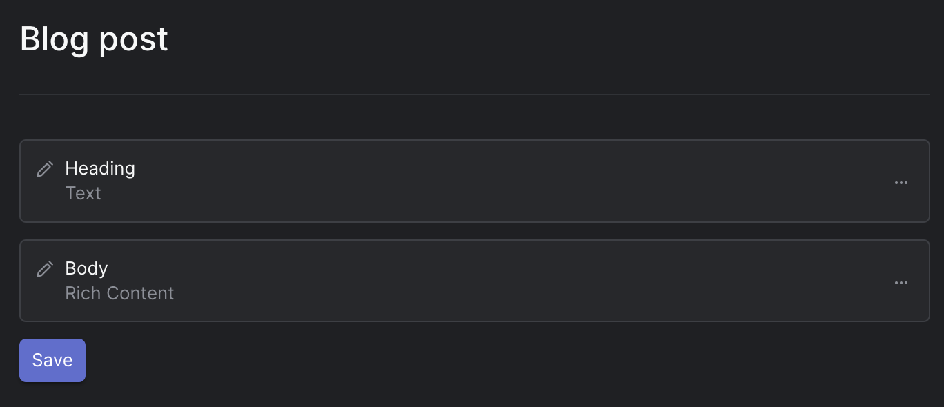
Simple Blog Post Template
Page sections
" }, "options": { "availableTypes": [ "text", "content", "hero", "bento" ] } }, } ], "templateType": "dt", "normalizedName": "page", "disableURL": false, "archived": false, "icon": "home", "hint": "A demo page", "searchFields": [], "filterFields": [], "composable": true, "filterable": true, "@metadata": { "@collection": "Templates", "Raven-Clr-Type": "Wieldy.Core.Models.Template, Wieldy.Core" } } ``` --- # Fields Source: https://strife.app/docs/reference/fields Fields define the structure and content of your templates. Each field specifies the shape and characteristics of the data that will be stored in the database. > [!WARNING] > This documentation page is still in progress and may not be fully complete. Please check back later for updates. ### Basic Field Settings All fields come with a standard set of basic settings:| Option | Description | |
|---|---|---|
| Name* | This setting is mandatory. It determines the property name used for storing and retrieving data from the database. It should be a unique identifier for each field and in camel case. | |
| Label* | This is the text used as a field label when you're editing the field inside Strife. It provides a human-readable name for the field. | |
| Tooltip | This setting allows you to provide additional information or hints about the field. Tooltips are displayed when users hover over or focus on the field. | |
| Autofocus | Autofocus can be enabled to make the field automatically selected or focused when editing, streamlining the user experience. | |
| Validation text | You can define custom validation text here to provide guidance or error messages when users input data that doesn't meet specific criteria. | |
| Tab Group | Groups fields under a specific tab in the editor | |
| Localizable | Enabling this settings allows the field to be localizable | |
| Tab group | When your template includes a Tab Group, use this setting to determine which tab the field should appear under in the editor. See this page for more info. |

Strife Studio screenshot of a Text field
| Option | Description | |
|---|---|---|
| Placeholder | A brief hint or instruction displayed in an input field to guide users on the expected content or format. | |
| Spellcheck | Enables or disables automatic spell checking in the browser |
Strife Studio screenshot of a Paragraph field
| Option | Description | |
|---|---|---|
| Placeholder | A brief hint or instruction displayed in an input field to guide users on the expected content or format. | |
| Spellcheck | Enables or disables automatic spell checking in the browser | |
| Display | Option between plain text and indented JSON format for text presentation. Default is text. |
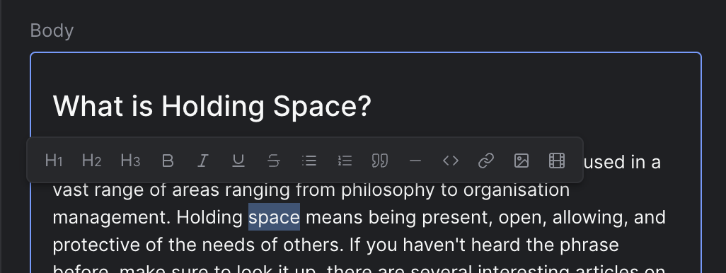
Strife Studio screenshot of a Rich Content field
| Option | Description | |
|---|---|---|
| Menu buttons | Selects which buttons appear in the slash-menu and which heading levels (H1–H6) are enabled. See Menu button values | |
| Placeholder Document~ | Specifies a node scheme that the document must follow. | |
| Lock Placeholder Document~ | Specifies whether the user should be prevented to add more nodes after what's specified under the placeholder-document. |
| Value | Description | |
|---|---|---|
heading1…heading6 | Enable the corresponding heading level. Include only the levels you want available. | |
bulletList | Unordered list slash-menu entry. | |
orderedList | Numbered list slash-menu entry. | |
checkList | Task list with checkboxes. | |
image | Image insert slash-menu entry. | |
video | Video insert slash-menu entry. | |
table | Table insert slash-menu entry. |

Strife Studio screenshot of a Number field
| Option | Description | |
|---|---|---|
| Placeholder | A brief hint or instruction displayed in an input field to guide users on the expected content or format. | |
| Min | Defines the minimum permissible numeric value, establishing a lower limit for data entry. | |
| Max | Establishes the maximum allowed numeric value, setting an upper limit for data entry. | |
| Step | Specifies the extent of value change when users interact with the field. Set the desired increment, such as 1 for whole numbers, 0.1 for one decimal place, 0.01 for two decimal places, and so on. |
Strife Studio screenshot of a Date field

Strife Studio screenshot of a Date Time field
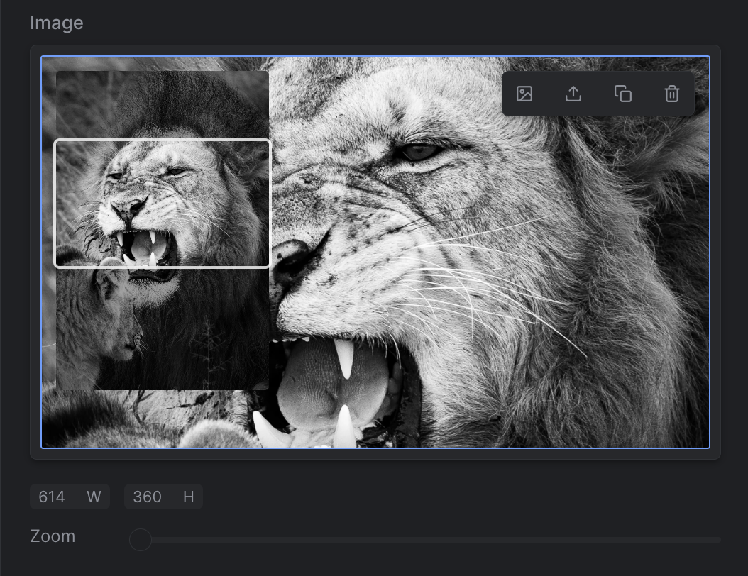
Strife Studio screenshot of an Image field
| Option | Description | |
|---|---|---|
| Width | Specifies the desired width of the displayed image. | |
| Height | Specifies the desired height of the displayed image. Set to 0 for a width-only image that keeps the source aspect ratio — the height is derived from the original, and crop/zoom are disabled. In defineType the same thing is spelled height: 'auto'. | |
| Format | Specifies the image format in which the image will be stored. Default is webp | |
| Padding color | Hex color used for the padded area of the image when the crop area is smaller than the source. | |
| Padding alpha | Alpha value between 0 and 1 for the padded area's transparency. | |
| Hide alt text | When enabled, the alt text field is hidden in the image editor. |
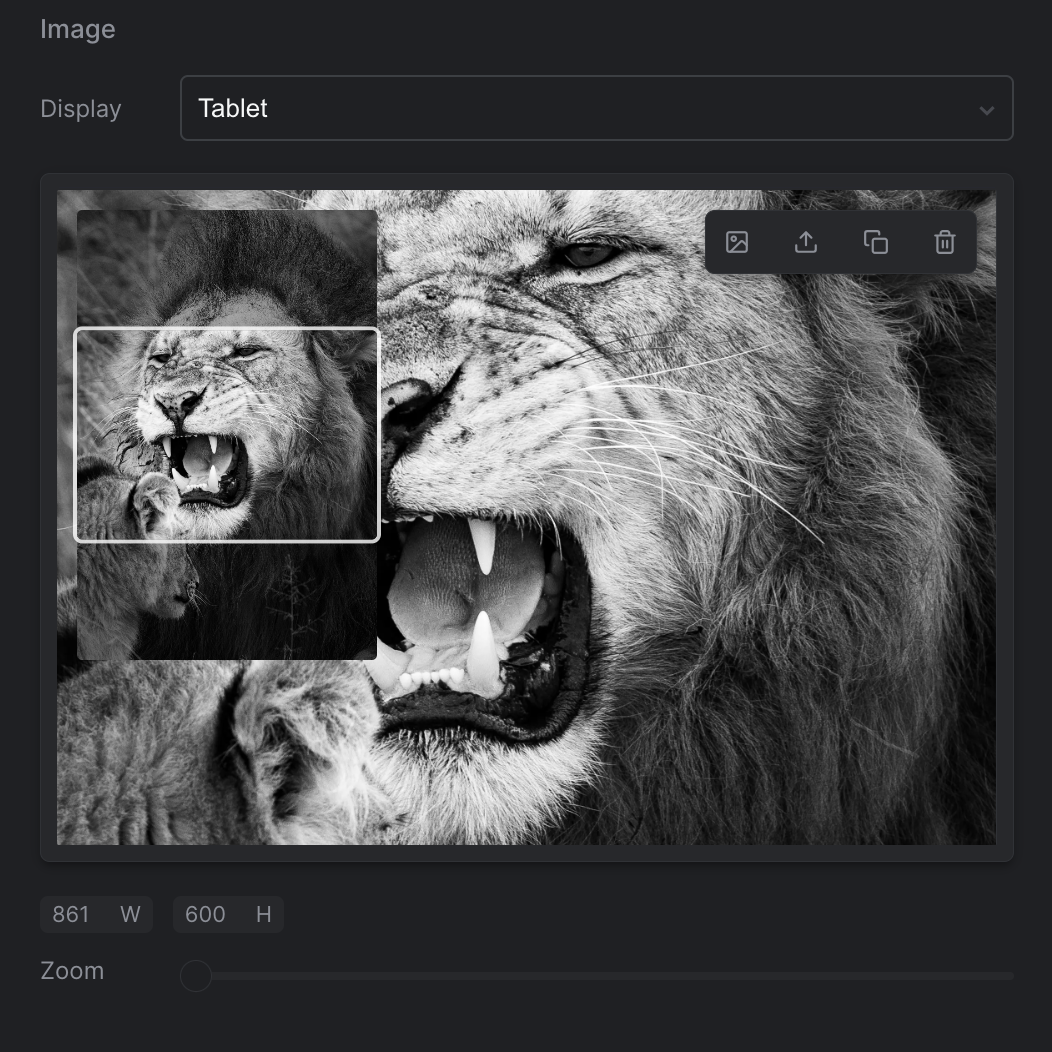
Strife Studio screenshot of an Image Group field
| Option | Description | |
|---|---|---|
| Medias | Specifies the various media formats by providing the format name/key, width, and height to add images tailored to different media requirements. Examples of medias could be 'Desktop', 'Tablet' and 'Mobile'. |

Strife Studio screenshot of a Toggle field
| Option | Description |
|---|---|
| Placeholder | Placeholder to display when no value is entered |
| Auto Check | The option to call an endpoint for validating the input as the user types |
| Option | Description |
|---|---|
| Multi select | Allow multiple values to be selected |
| Restrict collections | Restrict the collections that can be related |
| Option | Description |
|---|---|
| Restrict types | Restrict the types of assets that can be added to this assets list |
| Size | The maximum number of assets that can be added to this assets list |

Strife Studio screenshot of a Checkbox field
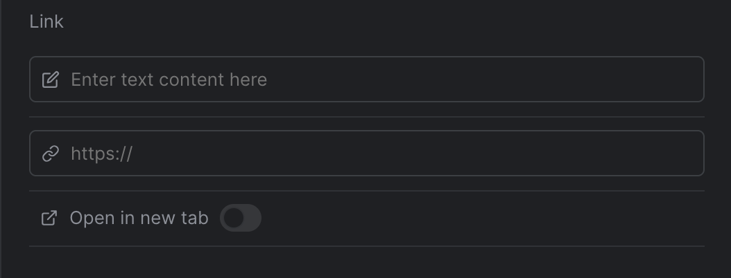
Strife Studio screenshot of a Link field
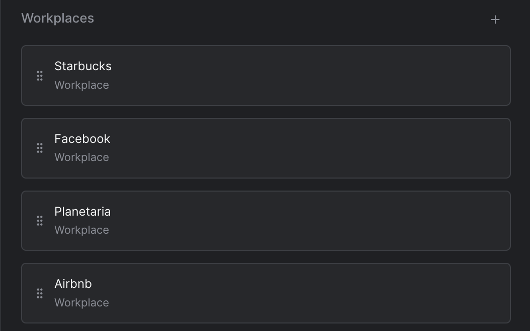
Strife Studio screenshot of a Chapters field
| Option | Description | |
|---|---|---|
| Restrict types | Sets the content templates available for use within the Chapters field | |
| Size | Optional setting for limiting the number of chapters allowed in the chapters editor | |
| Hint | A short description displayed inside the chapters editor to guide authors. |
| Option | Description | |
|---|---|---|
| Restrict types | Restrict the collections that can be added to this reference editor | |
| Size | Optional setting for limiting the number of references allowed |
| Option | Description | |
|---|---|---|
| Editor Type | Select the type of editor that can be added to the repeatable. Supported editor types include standard inputs (text, number, date), textarea, links, and combo boxes. | |
| Size | Optional setting for limiting the number of references allowed | |
| Options* | Options to display. Only available for combo box editors | |
| External source* | Use an external source to fetch options. Only available for combo box editors |
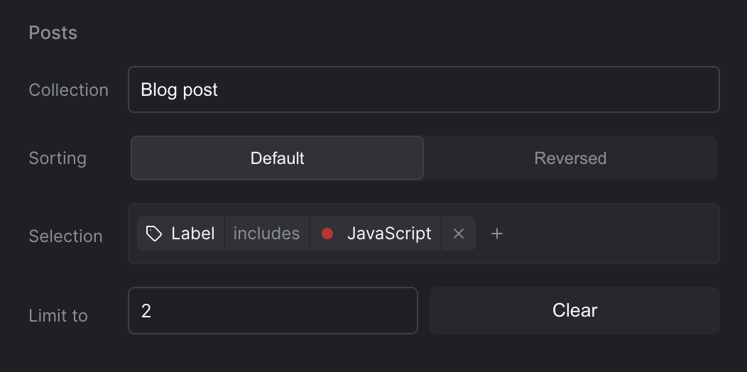
Strife Studio screenshot of a Collection field
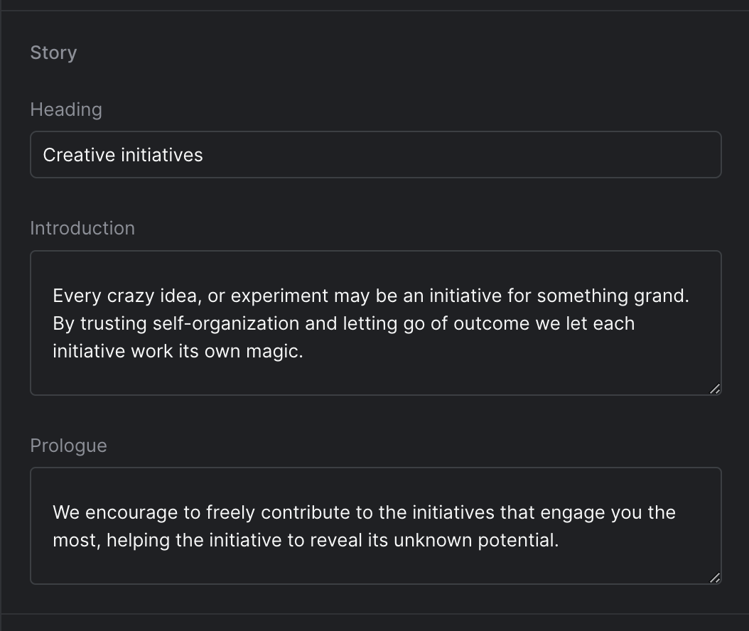
Strife Studio screenshot of a Content Template field
| Option | Description | |
|---|---|---|
| Content Template* | Selects the content template to use for editing |
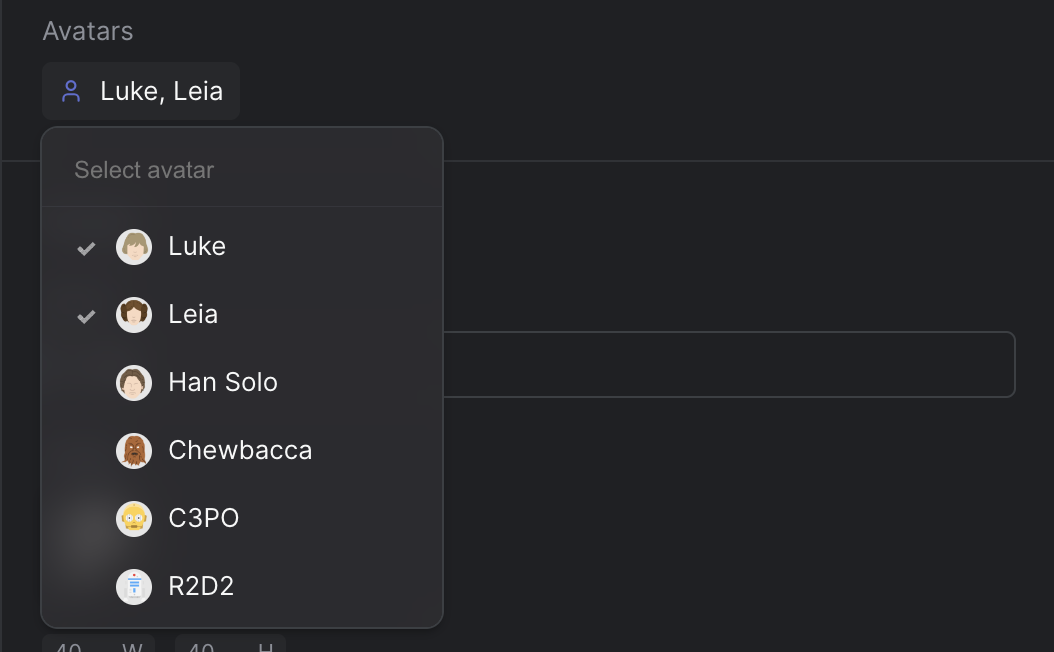
Strife Studio screenshot of an Combo Box field
| Option | Description | |
|---|---|---|
| Placeholder | Display a placeholder text in the search field after opening the combo box | |
| Icon | Displays an icon before the selected value in the combo box | |
| Multi select | Enables multi-select, allowing users to choose multiple options | |
| Options | Defines the choices presented in the drop-down. Each option is represented as an object containing a name, value, color hex value (optional), icon name (optional), and avatar url (optional) | |
| Default Value | Default value to display when no value is selected | |
| External source | Use an external source to fetch options. Use ${propertyName} to access the value of a property in the URL |
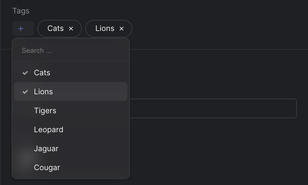
Strife Studio screenshot of an Multi Select field
| Option | Description | |
|---|---|---|
| Placeholder | Display a placeholder text in the search field after opening the combo box | |
| Check marks | Enables check marks on the selected values | |
| Options | Defines the choices presented in the drop-down. Each option is represented as an object containing a name, value, and color hex value (optional) |

Strife Studio screenshot of an Multi Input field
| Option | Description | |
|---|---|---|
| Type | Specifies the type of value to insert, which can be one of the following: Text, Number, Email, URL, Tel, Date Time, Date, Month, or Time | |
| Auto sort | Determines whether the field should automatically sort the inserted values as they are added |
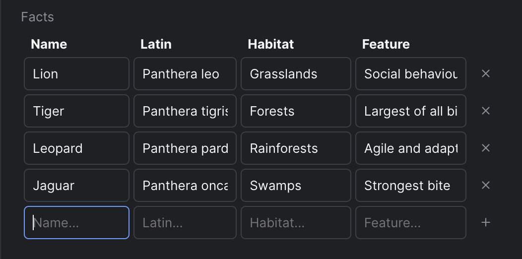
Strife Studio screenshot of an Table Input field
| Option | Description | |
|---|---|---|
| Headers | A JSON array of strings specifying the column headers. E.g ["Name","Latin","Habitat","Feature"] | |
| Input types | Specifies the input types for each header using a JSON array of strings. Supported types include 'text', 'number', 'date', 'datetime-local', 'email', 'month', 'tel', 'time', 'url', 'boolean', and 'multistring'. E.g. ["text","text","text","text"] | |
| Options | A JSON object containing the options for every 'multistring' input type. Use camel case header as property name. E.g. {"columnHeader": []} | |
| Sortable | Enables sorting in the Table Input field, which allows users to click on column headers for sorting. | |
| Sort by | Specifies the default sorting column header. | |
| Sort direction | Specifies the default sorting direction. | |
| Searchable | Enables search for large data sets. | |
| Display row numbers | If enabled, row numbers will be displayed in the Table Input field. | |
| Exportable | If enabled, the table can be exporterd/imported to/from CSV | |
| Export delimiter | Choose a delimiter for the export; file formats (CSV, TSV, TXT) |

Strife Studio screenshot of a File field
| Option | Description |
|---|---|
| Restrict types | Restrict the allowed types to upload in the File field |
| Option | Description |
|---|---|
| Tabs | Defines the collection of tabs within the group. Each tab entry contains a name (displayed in the editor UI) and a value (used internally to map fields to a specific tab). |
| Option | Description |
|---|---|
| Options | Options to display in the radio group. Each option must have a name and value while color, icon and avatar are optional |
| Default value | Default value to be selected in the radio group |